The coloured crystal glasses of the year 2018
- Posted on
- By Joanna Maya
- Posted in colour of the year, coloured glasses, Pantone colour of the year 2018, ultra violet, violet glasses
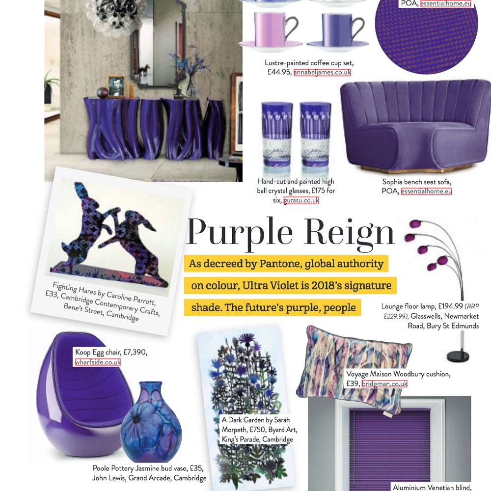
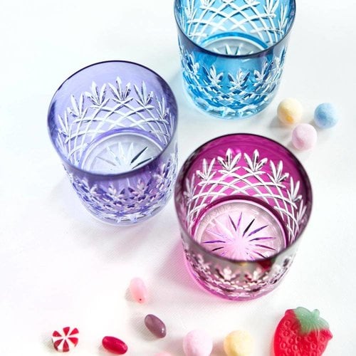
Every year, Pantone, the global color authority, calls together a panel to select a color of the year. In 2018 ultra violet was called a colour of the year. This rich hue is inspired by galaxies and exploration. In the home, we will see it in rich velvet through the winter and then more vibrant accessories and floral prints going into the summer. Our purple high ball and whiskey glasses received an excessive coverage in local, national and international press over the last two month.
At the begging of 2018 Pantone has revealed its colour of the year which we published on our social media channels. Our purple high ball and whiskey glasses received an excessive coverage in local, national and international press over the last two month. The leading, high-street titles include Homes & Gardens, Period Ideas, and Women & Home.
Laurie Pressman, vice-president of the Pantone Colour Institute, said: “The Pantone colour of the year has come to mean so much more than ‘what’s trending’ in the world of design; it’s truly a reflection of what’s needed in our world today.”
Source: https://www.pantone.com/color-of-the-year-2018
“Complex and contemplative, Ultra Violet suggests the mysteries of the cosmos, the intrigue of what lies ahead, and the discoveries beyond where we are now. The vast and limitless night sky is symbolic of what is possible and continues to inspire the desire to pursue a world beyond our own.”
What is the color of the year 2018?
Every year, Pantone, the global color authority, calls together a panel to select a color of the year. They review influences from the design world and beyond, looking to entertainment, art, popular travel destinations and even, in their own words, ‘new lifestyles and socio-economic conditions’.
It’s a choice intended to capture the mood of the time – and certainly, for anyone in the design world, it’s a steer that can influence projects of all kinds, from glassware to textiles.
How to use Pantone colour of the year?
This rich hue is inspired by galaxies and exploration. In the home, we will see it in rich velvet through the winter and then more vibrant accessories and floral prints going into the summer. It also compliments bright pinks and the jungle greens of recent years.
The purple colour is often associated with mindfulness practices, which offer a higher ground to those seeking refuge from today’s over-stimulated world. The use of purple-toned lighting in meditation spaces and other gathering places energizes the communities that gather there and inspire connection.
Purple is strong, purple is good but most importantly, purple is a timeless, classic colour which is ignorant of annual trends. Therefore, in our homes, using purple accessories, purple glassware, investing in wallpaper with a purple accent will not only enhance our mood dramatically but is this type of trend which has been and will be in vogue for years.
How can the new colours influence our lives and moods?
“Enigmatic purples have also long been symbolic of counterculture, unconventionality, and artistic brilliance. Musical icons Prince, David Bowie, and Jimi Hendrix brought shades of Ultra Violet to the forefront of western pop culture as personal expressions of individuality. Nuanced and full of emotion, the depth of PANTONE 18-3838 Ultra Violet symbolizes experimentation and non-conformity, spurring individuals to imagine their unique mark on the world, and push boundaries through creative outlets.”
It’s a safe and positive colour. It provides the reassurance we scream for amid a turbulent social and political landscape. Summing this up, it’s all about fighting the power, being bold and strong, and being truly original. That’s the mood for the year ahead.
Small details in our life can make a huge difference in how we feel. I am very glad that Pantone influenced the interior’s world and that now we will be able to choose something from the array of purple, little luxuries.

